
Google Changes G Logo , For The First Time In 10 Years
Google Changes G Logo – We search Google every day to know about something or other. Have you noticed that the world’s largest tech company, Google, has changed its logo after 10 years? After almost a decade, the company has changed its logo; now you will see the Google logo in a new color, and now the G icon has become more colorful than before. Google’s new logo is visible in iOS and Android beta version 16.8. You also read this How Many Megapixels Is The Camera Installed In A Drone
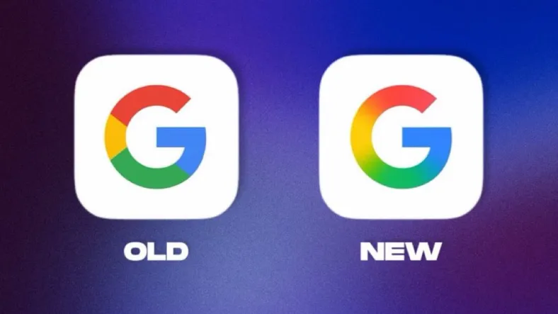
What’s new in the new ‘G’ logo?
The old G icon had four different colors like red, blue, green, and yellow blocks. The new one has the same four colors, but now you won’t see the blocks. In addition, you will see the new logo with a gradient design and a dynamic look. The new design icon has a modern look. Google has not yet provided information for the full rollout, although the new look is expected to start appearing on more devices in the next few weeks.
What is the reason behind the new logo?
The reason for Google’s new logo is not clear, but the company has indicated that it is focusing on AI at a rapid pace. According to media reports, Google has seen a new G icon in other services like Gmail and Maps. Google has not given any official information about this new update. However, this update has come just before the Google I/O event to be held on May 20. It is expected that the company may give more information about this at the event.
Google changes ‘G’ logo after 10 years
It is worth noting that Google’s ‘G’ logo is the most recognizable technology icon in the world. It is seen on billions of devices, browser tabs, app icons and more. Although this refreshed design may seem insignificant, it reflects how Google is changing in the age of AI. Google has changed its ‘G’ logo for the first time since 2015.
ALSO READ :CBSE Results 2025 Out: Check Here